-
Review: Plantronics Voyager Focus UC
When I started my new job, I was issued a MacBook Pro, an Acer monitor, an Apple wired keyboard, a cheapo mouse, and a few other things including a USB headset for use with Lync, i.e. Skype for Business. There was also a desk phone next to my computer that I haven't figured out the purpose as Lync lets me make phone calls. I brought in my own trackpad to replace the mouse and I was pretty much set. However, after a few conference calls with the USB headset, I asked my manager for something better; he and others had the Plantronics Voyager Focus UC. He ordered me one and it arrived this week. The headset isn't cheap (list price is $299), but I soon began to understand the high cost.
I quickly setup the headset, plugged in the Bluetooth adapter, installed the Mac software (it's kind of mediocre), reconfigured Lync to use the headset and I was off and running. I also paired it with my phone to play music. After a few hours with the headset (including a conference call), I was hooked. When you take the headset off, the music pauses; when you're on a Lync call, the LED on the Bluetooth adapter turns red; if you try to talk when the headset is on mute, you get an alert on the computer telling you that you are trying to talk and the most important feature is the active noise cancelling (ANC). When I put on the headset and turned on the ANC, all the noise of the office were drowned out and I had some peace and quiet.
For the first few weeks of work, I didn't listen to music and suffered through the noise. Since I got the headset, I've been listening to music almost all the time and have been able to get in the "groove" of my work even forgetting how long I've been sitting (good thing my Apple Watch reminds me to stand up!). In addition to listening to music, the conference calls have been crystal clear. I'm not quite sure what I would need in a headset.
Pros
- Active voice cancellation works well.
- Integrates well with Lync/Skype on the Mac. (Look for the -M version)
- Pairs easily with my iPhone and switches between Mac voice and iPhone music.
- Sound quality is very good for voice calls and music quality isn't bad.
- Controls are easy to access on the sides.
- When you remove the headset, music pauses; when you put them back on, the music continues.
Cons
- The cost is much higher than any headset I've ever used.
- The Mac software is subpar; there is a menubar item, but you have to hide the main window otherwise the menubar item goes away.
- If you set the output from the Mac to be the headset and are playing music, the music stops and plays alerts and then plays the music again. I expected the music to "duck" and then come back, but it is abrupt.
- Extended wearing of the headset causes slight discomfort.
- Sometimes a little static that seems to go away despite being less than a foot from the Bluetooth adapter.
Summary
After only a few days of using the headset, I've been contemplating buying a pair for my home office (at some point I'll be able to work from home sometimes). Even though I could move the headset home, the convenience of having one would be worth the money. Without having used the headset for a few days, there is absolutely no way that I'd plunk down this kind of money on something unseen. However, now that I've had time to use the headset, I should have bought this headset even if I just wanted to use them with my phone. I was on so many calls at my last job, that having these would have been a huge win for me. When I was told to buy a good headset for calls, I bought a cheap Bluetooth headset that crackles; I should have spent company money on something like this!
If you spend a lot of time on calls in an office, I'd definitely recommend this headset. If you're using Lync (Skype for Business), even better.
-
Guest Network with EdgeRouter Lite and UniFi Access Points, Take 3!
I've written about guest networks with UniFi Access Points twice before and since I've written those articles, the UniFi software has just gotten better and better. My instructions are close to no longer being needed, but not quite. In the latest versions of the UniFi controller (5.x), Ubiquiti has fixed issues with network slowdowns when turning on the guest network. This has excellent news and really simplifies the configuration.
For this post, I'm going to reuse some of my pictures and steps as I don't like to duplicate my work!
Start on the EdgeRouter Lite and do the following:
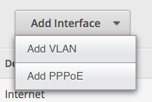
- On the EdgeRouter Lite’s Dashboard, click Add Interface and select VLAN.
-
Set up the VLAN as 1003 and attach it to the physical interface of your LAN. Give it an IP address in the range of a private IP block, but make sure you end it in a /24 to specify the proper subnet. (Make sure it is different than your normal private IP block.)
-
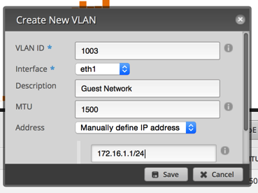
Click on the Services tab. Click Add DHCP Server. Set it up similar to the image below.
-
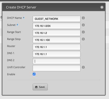
Click on the DNS tab under services. Click Add Listen interface and select the VLAN interface. Make sure you hit save.
Now it’s time to move over to the UniFi Controller.
- After you login to the controller, click the Settings in the lower left.

-
Click Networks.

-
Click Create New Network

-
Setup the network as indicated in the next image and then click Save.

-
Select User Groups on the left side.

-
Click Create New User Group.

-
Enter appropriate values to limit upload and download.

-
Select Wireless Networks on the left side.

-
Click Create New Wireless Network.

-
Configure the network similar to the next picture. Of course, set a password that isn't bullets!

-
Select Guest Control on the left side.

-
Configure the guest access how you find appropriate. Since I already have a WPA2 password, I just put in no authentication and some basic text. The important part of this screen is access control at the bottom. This area basically isolates guest clients from connecting to your LAN. In my prior configurations, I had to do this at the router level. This is much simpler and cleaner to setup.

Now you can test this by connecting to the guest network and accessing the Internet. On my network, I now get a captive portal; nothing fancy, but it's kind of cool.

Then try connecting to a device on your LAN or connecting to the EdgeRouter Lite. Both actions should fail.
I know that there are a lot of steps to configure this, but they’re not that difficult and you only have to do it once!
I’ve tested this and it is working well on my network; if I’ve missed anything, please let me know!
This configuration is much cleaner than my previous 2 attempts as most of the configuration is in the UniFi Controller. I'll be writing one last follow up on this topic when I swap out my EdgeRouter Lite for a UniFi Security Gateway (USG). While the EdgeRouter Lite is a great box, the USG is basically the same hardware, but all configuration is done through the UniFi Controller. I'm not quite ready to do the swap (I have one sitting on my shelf that Ubiquiti sent to me) as I'm waiting for the UniFi Controller to add a few more features like static DHCP assignments, static DNS entries, and IPv6 support (all via the GUI; this can already be done on the command line).
- On the EdgeRouter Lite’s Dashboard, click Add Interface and select VLAN.
-
Did I find my next new car?
In January, I wrote that I've delayed my decision to buy a new car. Last weekend I had some car trouble where my car wouldn't start and had to deal with it. My son asked me if I was going to get a new car and I said no; I'd just get it repaired. However, I decided to look at Apple's CarPlay site and pursued the list of cars that support it. None of the typical American cars like Ford or Chevy interested me and I am not getting a Ferrari! I saw that the 2017 Subaru Impreza will support it. At the auto show, I saw the Impreza and it was a decent looking car. It didn't have CarPlay and wasn't a plugin hybrid. Now that it will have CarPlay, I've decided to take another look. Plugin hybrids are kind of the neglected step child of car manufacturers; it's either hybrid or electric which kind of concerns me in terms of reliability and support. I'm going to forego the plugin hybrid for now and that should open up my search.
I found a few sites offering first looks as well as Subaru's own "sneak peak". It appears that the loaded package will have some interesting tech besides CarPlay. EyeSight® is a system that helps prevent collisions, notifies the driver if he (or she) drifts, as well as can work with the cruise control. Also, it has blind spot detection, cross traffic backup alerts, and high beam assist. In addition, it finally has a power adjustable driver's seat. So it would appear that the car (on the surface) has many of the features that I'd want in my next car.
On top of all the features, if the pricing remains similar to the 2016, the car would actually be affordable. EPA estimates for the 2016 are about 50% higher than my current vehicle which would be immediately noticeable as I am now driving a lot more for my commute. Subaru says that the car will be available in the later half of this year. Now I just wait so that I can give the car a test drive and see if it is the vehicle for me.
I'm crossing my fingers!
-
Commuting
In the last 4 weeks, I've commuted more than I have in the last 17 years. I'm starting to get used to the routine; the 30 minute drive each day isn't too bad, but it is an hour out of my day that I can't get back. I know that people commute everyday, but it is new to me.
My commute is against traffic which lets me get to work easily; no matter how fast I go, it takes me just about 30 minutes. On the way home, I pay for using the carpool lane (FasTrak) and while the cost varies depending on a number of factors, it is absolutely worth it for my sanity to not to have to sit in traffic. Like my drive to work, my drive home is about 30 minutes no matter what.
At some point I hope to work from home a few days a week. This will allow me to recover an hour each day I work from home and I think will help me more productive.
I wonder what would happen if people that could work remotely did so a few times a week. The office interaction is good, but I believe there can be a balance that affords people some of the benefits I've taken for granted most of my career.